Building Chartz: A Free Tool for Creating Charts and Reports in Your Browser
Every time I needed a quick chart for a university assignment or a clean visualization for a report, I found myself stuck in the same loop — sign up for a tool, hit the free tier limit, export with a watermark, repeat.
I decided to build something better. Something free, fast, and private.
Introducing Chartz
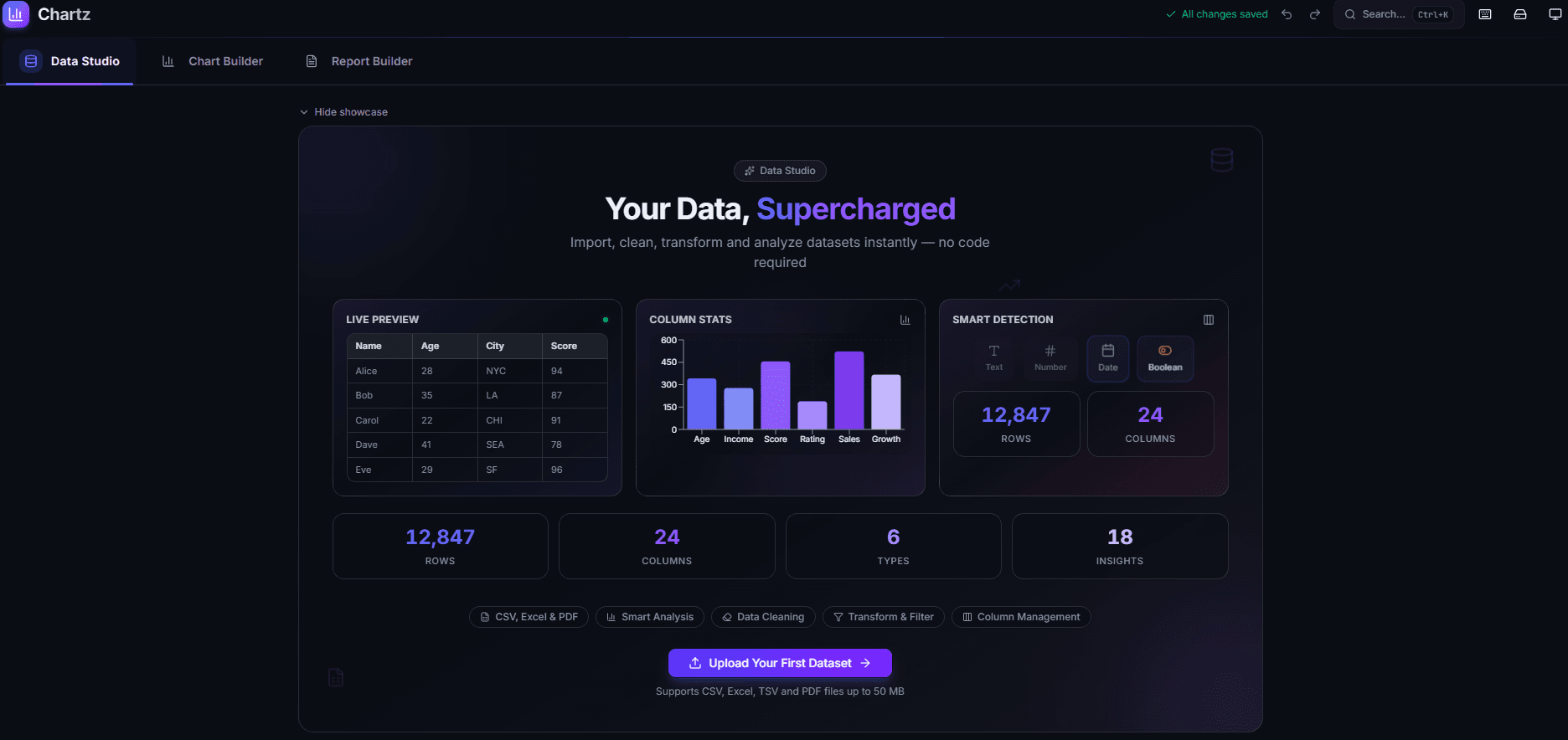
Chartz is a web app that lets you import data, create fully customizable charts, and build professional multi-page reports — all inside your browser. No accounts. No cloud uploads. No restrictions.
I built it as a single-page Next.js application where everything runs client-side. Your data never leaves your machine.
The Problem I Wanted to Solve
During my data science coursework, I noticed a gap. There are plenty of tools for analyzing data, and plenty for making presentations — but very few that let you go from raw data to a polished, exportable report in one place without friction.
I wanted something where a non-technical user could:
- Drop in a spreadsheet
- See their data analyzed automatically
- Pick a chart type and customize it visually
- Place that chart into a report alongside formatted text
- Export the whole thing as a PDF
No code. No configuration. No learning curve.
What You Can Do With It
Import and Explore Your Data
Chartz accepts CSV, Excel, and PDF files. When you upload a file, the app parses it, auto-detects column types, and gives you a full data table view. From there you can:
- View statistical insights — averages, distributions, outliers, correlations
- Clean your data — remove duplicates, handle missing values, filter rows
- Transform columns — create calculated fields, rename, reorder, change types
- Manage columns — hide, delete, or reorder what you see
The data tools are designed to be visual and immediate. You see the table updating as you make changes, not a code editor.
Build Charts with Full Customization
The chart builder supports over 15 chart types — bar, line, pie, area, scatter, radar, radial bar, treemap, funnel, composed charts, and more.
Every chart is fully customizable:
- Colors: 50+ built-in palettes, or pick individual colors for each data series
- Layout: Titles, subtitles, legends, grid lines, tooltips
- Animation: Toggle entry animations on or off
- Templates: Pre-configured chart styles you can apply with one click and then adjust
Once your chart looks right, you can export it as PNG, SVG, or PDF — or copy it directly to your clipboard.
Create Professional Reports
This is the feature I am most proud of. The report builder is a page-based editor where you can:
- Add text blocks with a rich text editor — headings, bold, italic, lists, alignment, text color
- Embed any chart you have created directly into the report
- Upload images or paste them from your clipboard
- Add dividers and spacers for clean visual separation
- Drag and drop to reorder elements
- Resize blocks by dragging any edge — width and height
Each report can have multiple pages with individual background colors. When you are done, one click exports the entire report as a multi-page PDF.
The goal was to make it feel like a simple document editor, not a complex design tool. You should be able to build a clean report in minutes, not hours.
Technical Decisions
Why Client-Side Only?
Privacy was a core requirement. I did not want users worrying about where their data goes. By keeping everything in the browser — parsing, rendering, storage, export — there is no server to trust and no data to leak.
All state is managed with Zustand and persisted to localStorage. Your datasets, charts, and reports survive page refreshes and browser restarts.
Why Next.js for a Client-Side App?
Next.js gives me the App Router structure, automatic code splitting, and optimized static export out of the box. The app is deployed on Vercel as a static site. There are no API routes, no server components fetching data — it is purely a delivery mechanism for a client-side React application.
The heavy components — chart builder, data studio, report builder — are lazy-loaded with dynamic() imports so the initial bundle stays small.
The Chart Rendering Layer
Charts are rendered with Recharts, which is built on top of D3 and outputs SVG. I wrapped it in a ChartRenderer component that dynamically selects the right Recharts chart component based on the chart type and maps the dataset columns to axes.
The style configuration is a flat object — colors, legend position, grid visibility, animation, stroke width — that gets merged with palette defaults. This makes it simple to apply templates: a template is just a partial style object that gets spread over the existing config.
Report Export Pipeline
The PDF export was the trickiest part. The pipeline works like this:
- Iterate through each report page
- Render the page DOM node to a canvas using html2canvas-pro
- Convert the canvas to a JPEG data URL
- Add it as a page in a jsPDF document
- Save the final PDF
The challenge was making the rendered output match what the user sees on screen — fonts, colors, chart SVGs, images all had to render correctly to canvas. html2canvas-pro handles most of this, but I had to be careful with SVG elements and cross-origin images.
Responsive Design
The app works on both desktop and mobile, but the interaction patterns are quite different:
- Desktop: Chart config lives in a collapsible side panel. Report elements are inserted from a labeled sidebar.
- Mobile: Chart config is a bottom sheet that collapses to a tab bar. Report elements are added via a floating action button with a popup menu. Navigation uses a bottom tab bar.
Getting this right took several iterations. The key insight was that mobile users need the content area maximized, so controls should collapse to minimal footprints and expand on demand.
What I Learned
Building Chartz reinforced a few things for me:
Start with the data flow, not the UI. I defined the data stores and types first — what a dataset looks like, what a chart config contains, what a report element is. The UI became straightforward once the data model was solid.
Responsive design is not just smaller screens. Mobile is not a shrunken desktop. The interaction patterns — bottom sheets vs sidebars, FABs vs toolbars, swipe vs click — need to be designed separately.
Users notice polish. The animated showcases, smooth transitions, and visual feedback (like resize handles highlighting on hover) make the app feel professional. These details took real time but they are what make someone want to keep using the tool.
Local storage is underrated. For tools where privacy matters and data is personal, browser storage is a perfectly valid persistence layer. No database, no auth, no backend — and the user gets unlimited, instant, private storage.
Try It
Chartz is live and free to use:
Upload a dataset, build some charts, create a report, export it. The whole flow takes a few minutes.
If you have feedback, suggestions, or feature requests, I would love to hear them. This is a project I plan to keep improving.
Comments (0)
No comments yet. Be the first to share your thoughts!